On many occasions, even in my book "The Secrets of Lettering", I have told you about the importance of negative space in the design of letters, as people think we design with black on white, when in fact it is the white of the paper. that determines the shapes of our beloved letters and how we should really look at these targets to correctly design typography or lettering.

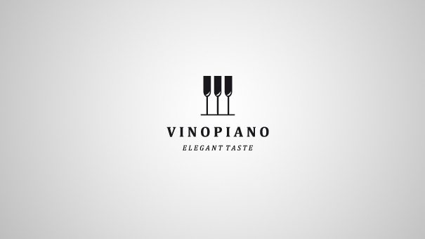
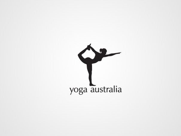
so, this time, we are going to observe how other designer colleagues have made brands and logos where the negative space is the main actor:


¿Cual es vuestro favorito? ¿Conocéis otros ejemplos de marcas o logotipos donde se haya empleado el espacio negativo como recurso de diseño?


CONVERSATION