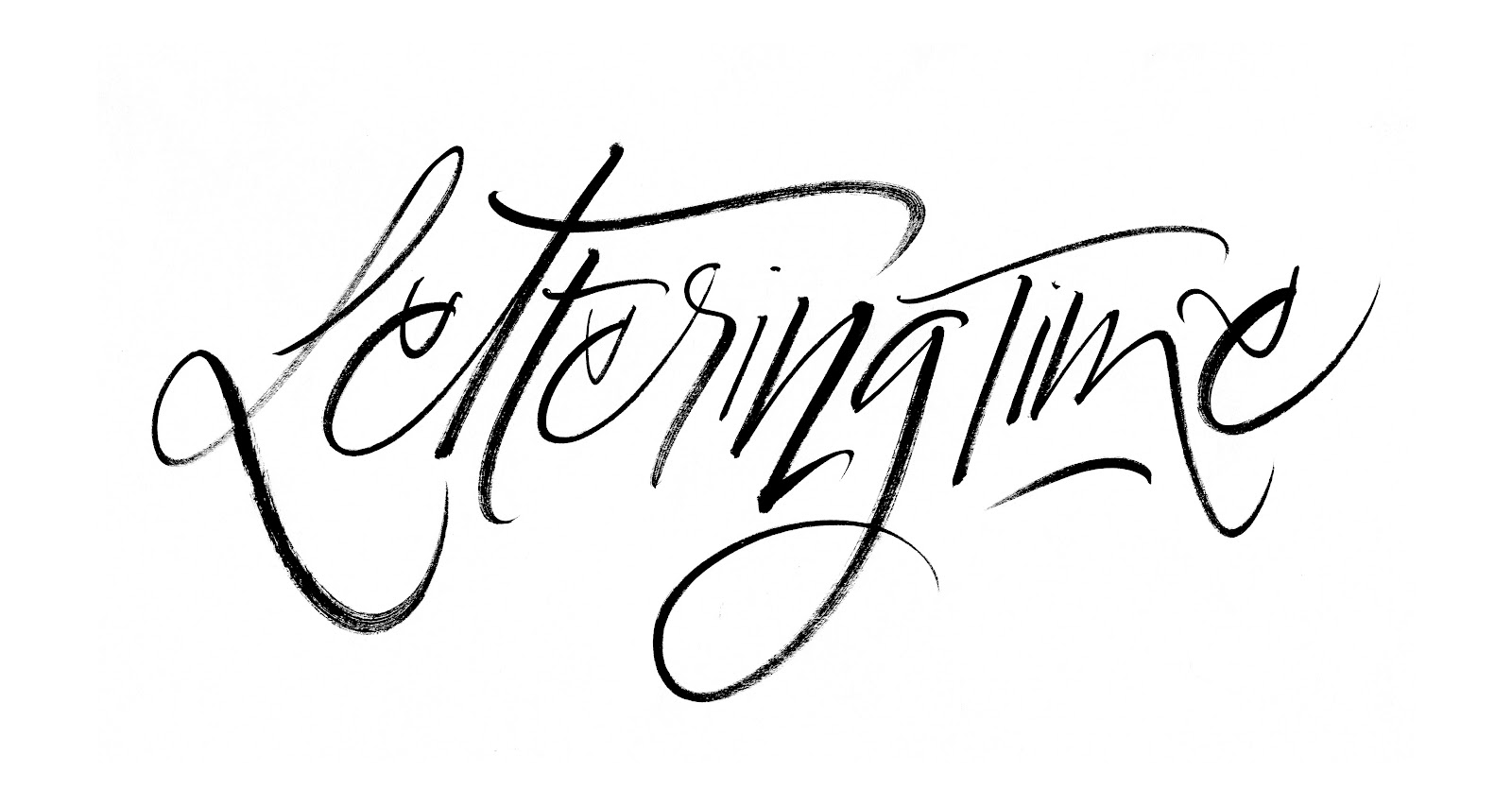
Today we bring you Lettering Time, one of the most wanted typefaces right now. The ELITE logo typeface.
And it is that the teen series on netflix is one of the most viewed and that most fans have right now. Many followers of our blog have asked us in recent weeks what is the typeface used in the ELITE logo and here we bring you the answer.
In the logo of this successful Netflix series, only typography has been used with the differentiating gesture that the last "E" has been turned horizontally. But ...
what is the font used in the Netflix "ELITE" series logo?
ok, we are going to give you two solutions, one for payment and another free font in direct download.
The most reliable answer to which is the typeface of the Elite series, is that the typeface used is almost 100% safe, the mythical typeface "Trajan Pro" designed in 1989 by Carol Twombly and which right now belongs to the Adobe typeface collection among other catalogs. You can get it by clicking here.
And you will say ok, ok, but I want to download for free the typography of the ELITE series from Netflix! ok, calm ijiji that as I told you before I have a second option totally free in direct download.
A free option to the ELITE logo is the Constantine typeface designed by Dukom Design. This font is almost identical to the Netflix series logo font and you can download it free here:


CONVERSATION